Introduction
Stella Rathmines is a uniquely luxurious 100 year old one-screen cinema restored to reflect the glitz and glamour of the 1920s. Stella Ranelagh is a 44-seater cinema with a state-of-the-art sound system and beautiful décor.
Creating a new web experience for this beloved brand was a challenge I was excited to accept. I took a design thinking approach to this project to make sure the user was center of all design decisions. Below shows the different methods used in each stage of the process.
Project Kick Off
Desk Research - Competitive analysis to get an early idea of what industry standards are like. What I felt was working well and wasn’t working well. This gave me something to bring to the initial stakeholder meeting to get an idea of what they are thinking - visuals, colours, style, functionality and talk through industry recognised patterns.
I also had a look at heatmaps on the current website and Google Analytics data on various pages.
Competitive Analysis
There were a few areas of the current website that the Stella team wanted to change but were cautious on how we should proceed. Nobody wanted to complicate the process of searching for films and booking tickets, but we felt there could be a better approach to it.
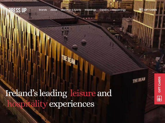
I conducted competitive analysis of various competitor websites and also cinema websites in different countries to try and establish a wide range of examples, to see how some of these challenges were approached by other websites.
The main areas I looked at were -
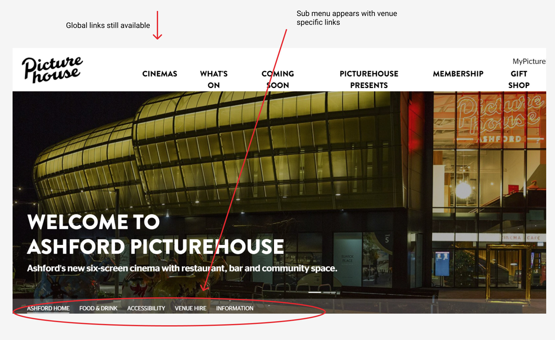
1. How to handle multi venues on one website
2. How to showcase the cinema more and show what is offered as the "Stella experience"
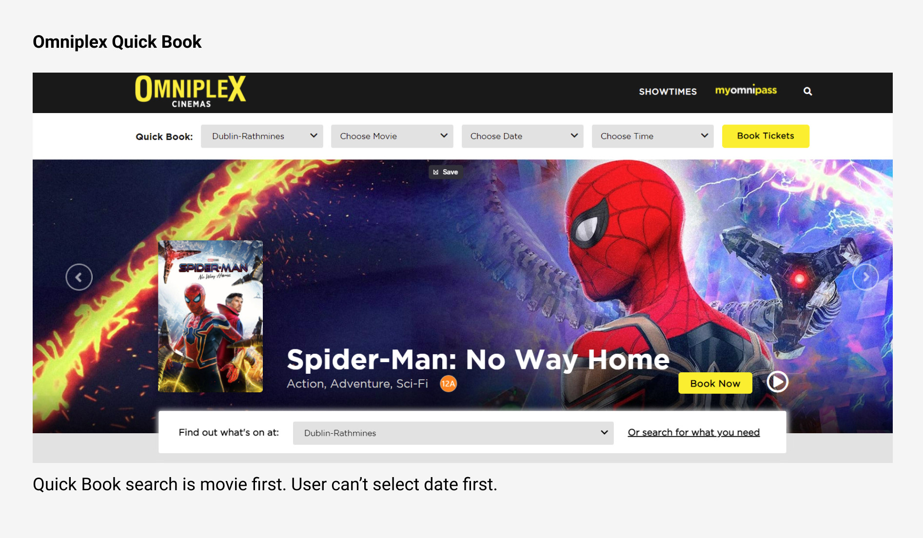
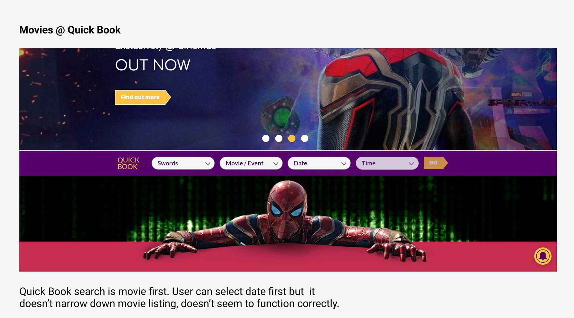
3. How were film listings handled on homepage and Film page
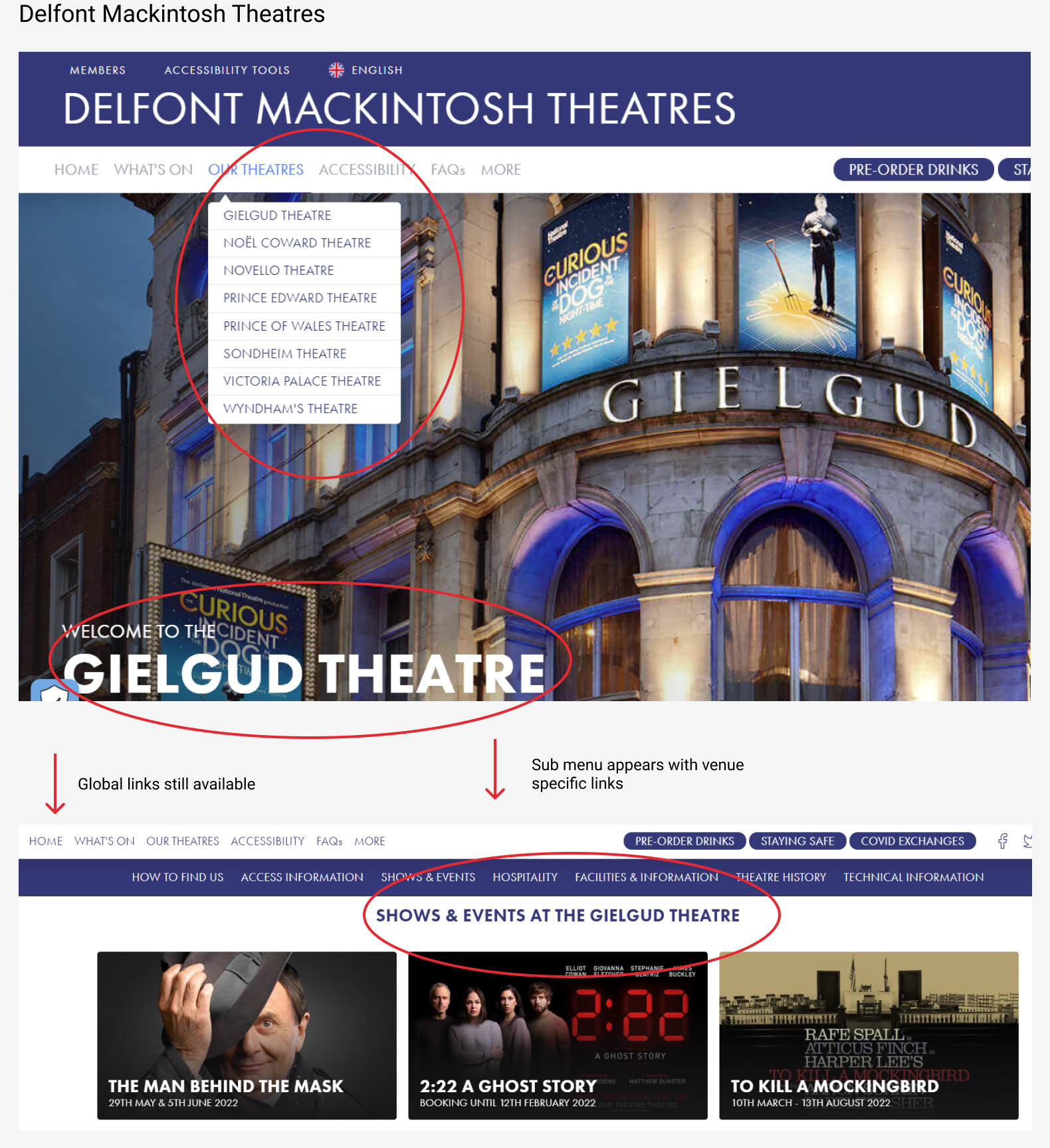
Heatmaps
Heatmaps were also used to analyse the existing Stella website to see how current users were navigating around the website and see what sections they interacted with the most. The "quick book" option was something I was looking out for to see if users searched mostly by movie or by date, as I didn't want to interrupt existing mental models from users.
Stakeholder Interviews and Requirements Gathering
To kick things off on this project I setup a stakeholder meeting with Stella Box Office and Marketing Manager, Stella Operations Manager, Photographer/Videographer and Web Developer. It was important for me to establish early on the business requirements, technical restrictions, stakeholder wants/"nice to haves" and phases we were going to go through on this project to achieve certain deadlines.
We also discussed findings from Google Analytics data to decide what pages were important and which were less important. I was also able to talk to them about tidying up the main navigation and what links should remain. Based on the conversations we had I wanted to then test (usability tests) sections/functions of the website they wanted to keep to make sure it was actually worth keeping and addressed user needs.
Empathise
Usability Tests and User Interviews
To find out user behaviour, needs and pain points I tested several users on the existing Stella website to see how they would do with some set tasks. To collect qualitative data, the users were asked several questions about their general cinema going habits and what they liked and disliked about a cinema experience.
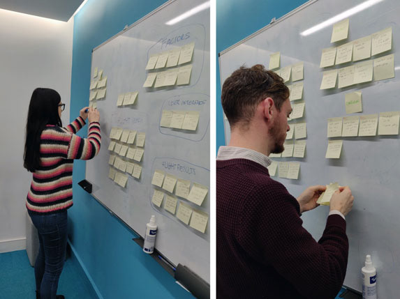
To analyse all this data, affinity diagrams were created to come up with some conclusions.
Define
How Might We Statement
To help focus the project and continue to make ideas in a user centered way, a problem statement was created.
"How might we create a new, more immersive experience, without alienating any
of our current audience and make bookings as easy as possible?"
To analyse the qualitative and quantitative data and find themes and patterns, I created an affinity diagram to come up with some good points, bad points and finally conclusions.
Information Architecture
Figuring out the navigation of the different sections of the website took a little bit of work, especially taking into account how to split the content for specific venues i.e. film listings specifically for Rathmines, venue information specifically for Rathmines. A sitemap helped everyone see a visual representation of this and made it easy to make any changes needed.
Ideate
Wireframes
After collecting insights from users and stakeholders it was time to put these learnings into designs to try and solve the issues while making sure no existing user would be put off by the new design. I started sketching so that I could brainstorm some ideas to see what might work and try to figure out how to best display all this information to a user in an easy way.
Requirements
- Make booking process easy
- Revamp how the film listings looked
- Explain the "Stella experience"
- Reduce the amount of calls Stella receive related to FAQs
I wanted users to have access to these bits of information in several places so that if they missed one link or one piece of text, they would hopefully get their answer in another section of the site.
The sketches then became mid-fidelity wireframes, which were presented to the Stella management. Right from the start of the project we maintained an open dialogue so I was happy to see the designs I had created were met with great enthusiasm and I could clearly see we were all on the same page.
Prototype
Once stakeholders were happy with the general layouts and ideas presented, I was able to continue the design phase with high fidelity mockups to see how colour, images and text would all blend. Usability tests were again carried out on these mockups to make sure user flows and visual interest were scoring well with users. Through out all wireframes and mock ups, constantly referring to research material captured was vital to ensure the user was kept at the forefront of designs.
Test
After testing a high fidelity mock up, it was time to hand over to the web developer to bring these designs to life. During the build process I was involved to make sure the overall user experience was maintained. Further testing took place on the newly built website before and after going live.

